常用特效
在前端页面开发中,特效是必不可少的,特效不仅可以增加页面的炫酷效果,还能增加页面的交互性,uni-app 提供了多种特效插件,本节通过 tabBar 导航和 swiper 轮播图给大家演示特效的使用。
tabBar导航使用
tabBar 一般用于底部导航,基本上在每个手机端都会用到,需在 pages.json 中进行设置,代码如下。
{
  "tabBar": {
    "borderStyle": "white", // 设置上边框颜色(black或white)
    "backgroundColor": "#dbdbdb", // 设置背景颜色
    "selectedColor": "#02b6ff", // 设置选中的文字颜色
    "color": "#666", // 默认文字颜色
    "list": [ // 每一个对象表示一个导航
      {
        "text": "首页", // 导航名
        "pagePath": "pages/index/index", // 导航链接
        "iconPath": "static/tabbar1.png", // 导航默认图标
        "selectedIconPath": "static/tabbar1-1.png" // 选中导航之后的图标
      },
      {
        "text": "登录",
        "pagePath": "pages/login/login",
        "iconPath": "static/tabbar4.png",
        "selectedIconPath": "static/tabbar4-1.png"
      }
    ]
  }
}
运行结果如图 13-9 所示。
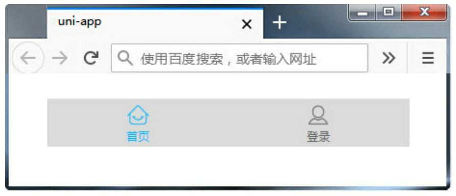
Figure 1. 图13-9 tabBar导航显示
swiper轮播图使用
swiper 轮播图也是经常使用的一个功能,uni-app 提供了非常方便的轮播图组件,代码如下。
<template>
  <view class="content">
    <swiper:indicator-dots="true":autoplay="true":interval="3000":duration="1000">
      <swiper-item>
        <view class="swiper-item">
          <image src="../../static/logo.png" mode="widthFix" class="bannerImg"></image>
        </view>
      </swiper-item>
      <swiper-item>
        <view class="swiper-item">
          <image src="../../static/logo.png" mode="widthFix" class="bannerImg"></image>
        </view>
      </swiper-item>
    </swiper>
  </view>
</template>
代码解析如下。
(1)indicator-dots 属性:是否显示指示点。 (2)indicator-color 属性:设置指示点颜色。 (3)indicator-active-color:当前选中的指示点颜色。 (4)autoplay 属性:轮播图是否自动切换。 (5)interval 属性:轮播图自动切换的时间间隔。 (6)duration 属性:滑动动画时间。