Vue 组件 Tag
JSX 和渲染(render)函数非常适合渲染组件需要非常动态的情况。
在常规 Vue.js 模板中实现此目的的方法是使用组件(component)标签。
组件标签使用 is 属性来动态选择将渲染哪个组件。
为了渲染动态组件,我们使用带有绑定 is 属性的组件(component)标签(这里,我们使用简写 :is,相当于 v-bind:is):
<component :is="componentName" />我们现在将学习如何使用名称或组件引用来渲染动态组件。
按名称或组件引用渲染动态组件
比方说,我们有一个包含 items 的网格,这些项目的显示可以在卡片显示(带有图像和文本的设计元素)或纯图像视图之间切换。
首先,我们需要导入相关组件并将其注册为组件。我们还将设置一些固定数据,以便在网格中循环使用:
<template>
<div id="app">
    <div class="grid">
        <component
            class="grid-item"
            v-for="item in items"
            :key="item.id"
        />
    </div>
</div>
</template>

<script>
import Card from './components/Card.vue';
import ImageEntry from './components/ImageEntry.vue';

export default {
    components: {
        Card,
        ImageEntry
    },
    data() {
        return {
            items: [
                {
                    id: '10',
                    title: 'Forest Shot',
                    url: 'https://picsum.photos/id/10/1000/750.jpg',
                },
                {
                    id: '1000',
                    title: 'Cold cross',
                    url: 'https://picsum.photos/id/1000/1000/750.jpg',
                },
                {
                    id: '1002',
                    title: 'NASA shot',
                    url: 'https://picsum.photos/id/1002/1000/750.jpg',
                },
                {
                    id: '866',
                    title: 'Peak',
                    url: 'https://picsum.photos/id/866/1000/750.jpg'
                },
            ]
        }
    }
}
</script>
然后我们可以按名称引用组件 - 即卡片(card)和图像条目(image-entry) - 并将 itemComponent 设置为 is 的值:
<template>
    <!-- rest of template -->
    <component
        :is="itemComponent"
        class="grid-item"
        v-for="item in items"
        :key="item.id"
    />
    <!-- rest of template -->
</template>

<script>
// rest of script
export default {
    // other component properties
    data() {
        return {
            itemComponent: 'card',
            // other data properties eg. `items`
        }
    }
}
</script>
在这种情况下,Card 组件将渲染,因为我们将其小写名称(card)传递给组件标签。
如果我们将 itemComponent 转换为 image-entry,则 ImageEntry 组件将渲染。可以使用 v-model 进行如下切换:
<template>
    <!-- rest of template -->
    Display mode:
    <input
        type="radio"
        name="style"
        value="card"
        v-model="itemComponent"
        id="card-radio"
    />
    <label for="card-radio">Card</label>
    <input
        type="radio"
        name="style"
        value="image-entry"
        v-model="itemComponent"
        id="image-radio"
    />
    <label for="image-radio">Image</label>
    <!-- rest of template -->
</template>
我们还可以使用组件引用本身(而不是名称)将组件传递给 is。例如,我们可以将 itemComponent 设置为 Card:
<script>
// rest of script
export default {
    // other component properties
    data() {
        return {
            itemComponent: Card,
            // other data properties eg. `items`
        }
    }
}
</script>
在这种情况下,在卡片视图和图像视图之间切换会更加困难,因为我们需要使用组件引用而不是使用名称。我们可以将 props 传递给已使用 component 动态渲染的组件,就像我们使用 v-bind:prop-name 或 :prop-name 简写传递常规 props 一样:
<template>
    <!-- rest of template -->
    <component
        class="grid-item"
        v-for="item in items"
        :key="item.id"
        :is="itemComponent"
        :url="item.url"
        :title="item.title"
    />
    <!-- rest of template -->
</template>
给定以下 Card 和 ImageEntry 组件,我们得到一个具有可切换网格项视图的应用程序。
Card.vue 渲染图像和标题,最大宽度为 150px:
<template>
<div class="card">
<img :src="url" width="100%" />
<h3>{{ title }}</h3>
</div>
</template>
<script>
export default {
props: {
url: String,
title: String
}
}
</script>
<style scoped>
.card {
margin: 10px;
max-width: 150px;
}
h3 {
font-weight: normal;
}
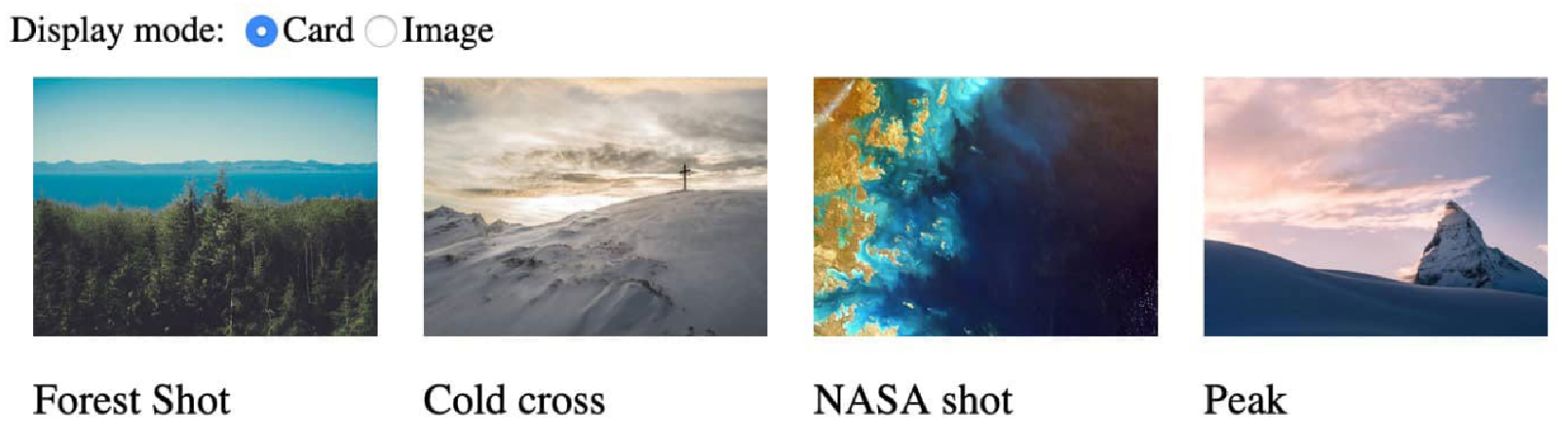
</style>您的输出将在卡片视图中显示条目,如下所示:
使用 ImageEntry.vue 仅渲染卡片视图宽度两倍的图像:
<template>
<img class="image" :src="url" />
</template>
<script>
export default {
props: {
url: String
}
}
</script>
<style scoped>
.image {
margin: 20px;
max-width: 300px;
}
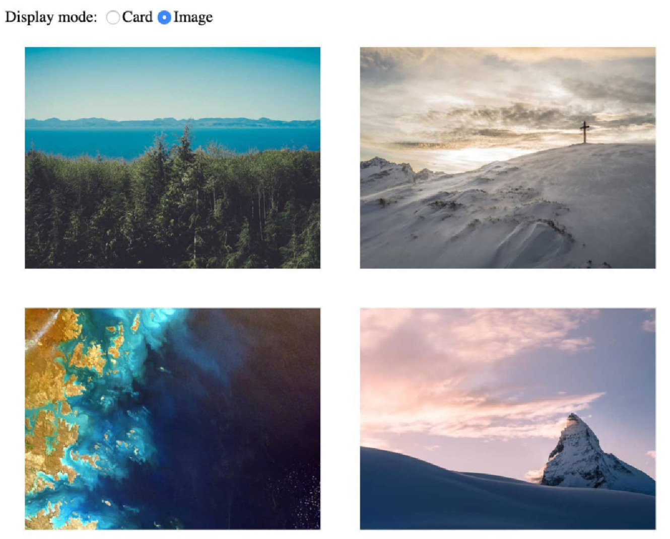
</style>您现在将在图像视图中看到条目,如以下屏幕截图所示:
组件(component)标签的一个警告是,当渲染的动态组件不再显示时,它会被完全拆除。在此示例中,正在渲染的动态组件没有任何状态,因此此拆卸不会产生任何问题。
我们现在将了解如何缓存动态组件状态。
使用 Keep-Alive 缓存动态组件状态
通过 component 标签动态渲染的组件可以具有状态,例如在 multipart 表单中,在下一页上具有 name 字段和 address 字段。
让我们用组件(component)标签来实现它,如下所示:
<template>
    <div id="app">
        <component
            :is="activeStep"
            @next="activeStep = 'second-step'"
            @back="activeStep = 'first-step'"
        />
    </div>
</template>

<script>
import FirstStep from './components/FirstStep.vue'
import SecondStep from './components/SecondStep.vue'

export default {
    components: {
        FirstStep,
        SecondStep
    },
    data() {
        return {
            activeStep: 'first-step',
        }
    }
}
</script>
通过这样做,我们可以在 Name 字段中输入数据:
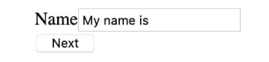
如果我们使用 “下一步” 导航(到表单的地址部分),然后 “返回”,则该名称将消失,如以下屏幕截图所示:

这是因为该组件在不是当前渲染的动态组件时被拆除(销毁)。
为了解决这个问题,我们可以在组件(component)标签周围使用 keep-alive 元素:
<template>
    <!-- rest of template -->
    <keep-alive>
        <component
            :is="activeStep"
            @next="activeStep = 'second-step'"
            @back="activeStep = 'first-step'"
        />
    </keep-alive>
    <!-- rest of template -->
</template>
以这种方式,填写姓名并从表格的地址部分返回将显示以下内容:

这样,我们就学会了如何使用组件(component)标签来表示一个区域,在该区域中我们可以根据字符串或组件本身(导入时)动态显示组件。我们还探讨了如何解决组件的主要问题;即当组件标签中没有主动使用组件时,如何使用 keep-alive 来维护组件状态。
练习 5.03:使用组件(component)标签创建动态卡片布局
现代应用程序布局是带有卡片的网格。卡片(Card)布局的优点是非常适合移动、桌面和平板电脑显示。在本练习中,我们将创建具有三种不同模式的动态卡片布局以及在这三种模式之间进行选择的方法。这种布局将允许用户选择屏幕上显示的信息量以满足他们的喜好。
-
丰富(Rich)视图将显示项目的所有详细信息,包括图像、标题和描述。
-
压缩(Compressed)视图将显示所有详细信息,但不显示图像预览。
-
列表(List)视图将仅显示标题,并且应该是垂直布局。
每个卡片(Card)视图将作为单独的组件实现,然后使用组件(component)标签动态渲染。要访问本练习的代码文件,请参阅 https://packt.live/3mYYvkq 。
请按照以下步骤完成本练习:
-
在 src/components/Rich.vue 创建丰富的布局。它包含三个属性,分别称为 url(图像 URL)、标题(title)和描述(description),并分别渲染图像、标题和描述:
<template> <div class="card"> <img :src="url" width="100%" /> <h3>{{ title }}</h3> <p>{{ description }}</p> </div> </template> <script> export default { props: ['url', 'title', 'description'] } </script> <style scoped> .card { display: flex; flex-direction: column; max-width: 200px; } h3 { font-weight: normal; margin-bottom: 0; padding-bottom: 0; } </style> -
使用一些夹具数据设置 src/App.vue:
<template> <div id="app"> </div> </template> <script> export default { data() { return { items: [ { id: '10', title: 'Forest Shot', description: 'Recent shot of a forest overlooking a lake', url: 'https://picsum.photos/id/10/1000/750.jpg', }, { id: '1000', title: 'Cold cross', description: 'Mountaintop cross with snowfall from Jan 2018', url: 'https://picsum.photos/id/1000/1000/750.jpg', }, ] } } } </script> -
将 Rich 视图组件导入到 src/App.vue 并在本地注册:
<script> import Rich from './components/Rich.vue' export default { components: { Rich }, // other component properties, eg. "data" } </script> -
一旦我们获得了 Rich 视图组件,将其连接到 src/App.vue 中的应用程序,使用组件(component)渲染它,并传递相关的 props:
<template> <!-- rest of template --> <component v-for="item in items" :key="item.id" :is="layout" :title="item.title" :description="item.description" :url="item.url" /> <!-- rest of template --> </template> <script> export default { // other component properties data() { return { layout: 'rich', // other data definitions eg. `items` } } } </script> -
这是添加一些样式以使网格看起来像网格的好方法:
<template>
    <!-- rest of template -->
    <div class="grid">
        <component
            v-for="item in items"
            :key="item.id"
            :is="layout"
            :title="item.title"
            :description="item.description"
            :url="item.url"
        />
    </div>
    <!-- rest of template -->
</template>

<style scoped>
.grid {
    display: flex;
}
</style>
这将显示以下输出:
 Figure 6. Figure 5.17: Rich component rendering dynamically
 -
现在,实现压缩(Compressed)视图,它只是没有 Compressed.vue 文件中的图像的 Rich 视图:
<template> <div class="card"> <h3>{{ title }}</h3> <p>{{ description }}</p> </div> </template> <script> export default { props: ['title', 'description'] } </script> <style scoped> .card { display: flex; flex-direction: column; max-width: 200px; } h3 { font-weight: normal; padding-bottom: 0; } p { margin: 0; } </style> -
在 src/App.vue 中导入并注册 Compressed 组件:
<script> // other imports import Compressed from './components/Compressed.vue' export default { components: { Rich, Compressed, }, // other component properties } -
添加一个选择(select)以在视图之间切换。它将有两个选项,分别为丰富(rich)和压缩(compressed),并将使用 v-model 绑定到布局(layout):
<template>
    <!-- rest of template -->
    Layout: <select v-model="layout">
        <option value="rich">Rich</option>
        <option value="compressed">Compressed</option>
    </select>
    <!-- rest of template -->
</template>
使用此选择(select),我们可以切换到压缩(compressed)布局,如下所示:
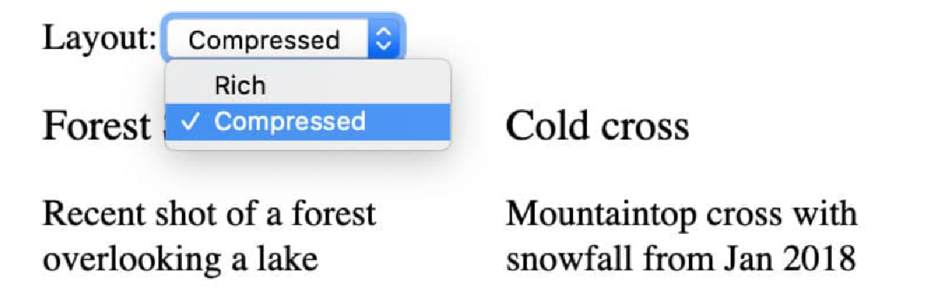 Figure 7. Figure 5.18: Compressed layout with select open
 -
将列表布局添加到 src/components/List.vue。列表(list)视图是压缩视图,但没有说明:
<template> <h3>{{ title }}</h3> </template> <script> export default { props: ['title'] } </script> <style scoped> h3 { width: 100%; font-weight: normal; } </style> -
将 List 组件导入到 src/App.vue 中并在本地注册:
<script> // other imports import List from './components/List.vue' export default { components: { Rich, Compressed, List }, // other component properties } -
添加一个带有 value="list" 的额外选项以切换到列表(List)布局:
<template>
    <!-- rest of template -->
    Layout: <select v-model="layout">
        <option value="rich">Rich</option>
        <option value="compressed">Compressed</option>
        <option value="list">List</option>
    </select>
    <!-- rest of template -->
</template>
切换到列表布局时,项目以水平行显示,如下所示:
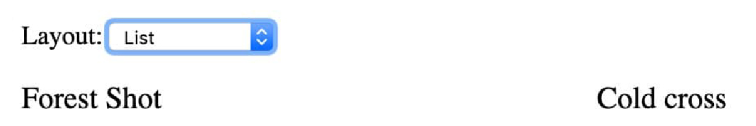 Figure 8. Figure 5.19: List view with incorrect horizontal stacking
 -
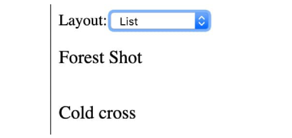
要修复此水平堆叠,请创建一个新的 grid-column 类,该类设置 flex-direction: column (与默认的 row 相反),并在布局为列表(list)时有条件地应用它:
<template>
    <!-- rest of template -->
    <div class="grid" :class="{ 'grid-column': layout ==='list' }">
    <!-- grid using component tag -->
    </div>
    <!-- rest of template -->
</template>

<style scoped>
/* existing rules */
.grid-column {
    flex-direction: column;
}
</style>
我们的列表(List)布局现在如下所示:
这样,我们就学会了如何使用组件(component)标签通过名称和组件对象本身来动态渲染不同的组件。我们还探讨了有状态动态组件的陷阱,即组件不再显示时的卸载以及如何使用 keep-alive 元素规避它们。
现在我们将了解如何仅使用渲染(render)函数或使用功能组件的模板(template)标签来实现简单的组件。